Showing posts with label PDP L5. Show all posts

Holden's Studio Visit


I visited Holden's design studio based in manchester to show some of my work and get feedback from Jack and John, two of the people i contacted who work their. While visiting the studio i met various members of staff that work in the studio and was shown around the environment that they work in swell as being shown some of the work they have done to give me more of an insight into their working environment as well as receiving constructive feedback on my own work.

Holden's was formed in 2011 and describe themselves as a creative agency with all the integrated expertise in one place: Branding, Communications, Digital, Environment Design, Experiential and Virtual Reality.

From looking at some of the work they have done they seem to do quite a lot of interior design and branding work for clients as well as motion advertisements, these are some of the clients they have worked for:


Feed Back For My Work:

I deiced to show my making of pieces as i wanted some feedback on these as i felt i was not making pieces as good as i could have for my making of videos, the advice they gave me for both of the making of videos was that the stages i showed were good and showed progression however i needed to think more about how the viewer would see what i am showing and try and make it more understandable, even for someone who hadn't seen my orchrad pig or syfy animations, and also to explain the project better, and why i am creating the work/ who for. 

Orchard Pig:
for the main animation of the orchard pig advert i showed first so that the making of made more sense they told me that the words at the end would probably work better with out a drop shadow and that this is somthing they avoid in their work, and that i could make the text pop more by simply using a darker background colour. 
I was also told about Duik, a free plugin on after effects which helps with character rigging when they saw that i had used the pupet tool to animate the pig in this piece. 
Swell as this they also mentioned that on after effects (for the video footage i recorded for inside the paint splatters in this piece) i could use a warp stabiliser to help reduce the appearance of the camera shake in my footage.

SyFy:
for my Syfy Ident they mentioned that perhaps having some floating particles in the environment would look effective and reinforce the appearance of the syfy cell being suspended in a fluid environment and inside the body. They also mentioned with regards to the imagine greater text i added at the end that the particles were static as they started to fade in and that using the randomiser effect on this would make them move more. 
Swell with the transitions of the cell they said it was a bit static (all in one place) and maybe to make it look more organic and fluid and as though it is a real cell have it move and morph in different directions as it splits.
Another thing they said to create a more 3d looking environment was to have the tentacles of the cell facing forwards and backwards more or to have some more in the background to add depth. 

They also mentioned while we were there that calling studios is a good way to get in contact with them as well as emailing, and directly addressing the people that work at the studio when emailing as it shows some existing knowledge about the place and the people that work there. And that in cinema 4D (referring to helping me with the project i am doing now for wham) putting the bump on a texture to just 2 percent can make it look a bit more plastic. 

Overall the experience i and while visiting was very helpful and the people were welcoming and friendly and interested in the work i was presenting which was nice as they were taking time out of their day to look at it for me, as we spend an hour looking at mine and hannah work as well as them showing us some of their own work. The feedback i have been give was defiantly helpful and i liked that fact that i wasn't just being told the positives about my work as the constructive feedback has given me more to think about and adapt in each of these pieces and for my future work. 

Heather Benning

Heather Benign is a Saskatchewan installation artist who's dolls house project relates to My collaboration project idea for wham:

T h e D o l l h o u s e

The Dollhouse was an 8 year project, which reached completion on March 23rd, 2013. In 2005 Benning acquired the use of a farmhouse, abandoned in the late 60's. The house was located near Sinclair Manitoba on highway #2. For over 18 months she re-shingled the roof with recycled shingles and restored and furnished the house to the era the house was abandoned.  She then removed the north-facing wall and replaced it with plexi-glass. The house was officially opened to the public June 9th, 2007. The house then stood tomb-like as a life-sized dollhouse for 6 years.

In October of 2012 the house began to show its age, the foundation was compromised. The house was only meant to stand as long as it remained safe. In March of 2013 The Dollhouse met it's death with fire.
The Dollhouse images are currently represented by "Telephone Booth Gallery" in Toronto.


Looking at the lighting she has used in the picture where the house is in tact is a good source of inspiration for our dolls house as the lighting is typical of a dolls house with regards to the fact that it has a warm glowing visual effect. 

Mind Map

This mind map is to illustrate connecting artists themes styles and theorists that have resonated and inspired my work in the projects this year and to show the connections between them and how my work is connecting to these topics and themes etc.


Alexander Mcqueen Fashion Animations

I think these two pieces show an interesting style that is in the same kind of area as my personal style with silhouettes shapes and simplistic colour schemes however potent content of subject matter and underlying meanings and metaphors, and both of these pieces are inspiring to me and will be referred back to for my own personal projects.

Promotional video for alexander mcqueen and pumas raw power clothing By Filmaker and photography Drew Cox:
Alexander Mcqueen/Puma - Raw Power from DREW COX on Vimeo.


I want to take my work towards a more 3D style of work and start using cinema 4d more as i think it offers more than after effects with regards to creating things that don't exist and new worlds etc which is what i enjoy creating. I think this piece shows aspects of my works style and kind of shows where i could take and adapt my style to with regards to getting better at using the 3d programmes as this piece is made in 3d and works well.
Breakfast Of Champions Promotional video for Alexander McQueens Fashion Night Out Show:

Drew Cox

2010 Showreel Drew Cox from DREW COX on Vimeo.

This is the showreel promotional video for Drew Cox who is an award winning video director and photographer with a creative eye for unique and engaging visual storytelling.

I discovered this artists when looking at the alexander Mcqueen fashion videos after discovering these through the breakfast of champions work i looked at (who are a studio based in london). And i think his style is unique and interesting and leaves the viewer wanting more. His style is also somthing that i would like to take my work towards.

Show reels

A lot of the visual fx show reels i have looked at tend to show elements of the making of the work behind the actual footage. They show pre texturised render versions of the animations and show the before and after effects of this. This shows the process they have taken to get to the finished result and makes the finished display look more impressive. My work probably isn't advanced enough to use this in my show reel nor would it probably be needed for advertising my self to potential studio employers. However it is interesting and somthing to potentially think about and could also be helpful if i made these for personal use to see in the future or re cap on how i made my work.
FX Show Reel 2015 from Steven Dupuy on Vimeo.
Richard Lico Show Reel 2014 from Richard Lico on Vimeo.
FX Show Reel 2014 from Steven Dupuy on Vimeo.

CCTV Advert

CCTV "INK" (Directors Cut) from weareflink on Vimeo.

Client: CCTV - Central China Television
Agency: MMIA
Creative Director: Zhou Jiahong

This is a piece i found that i think reflects my personal style with regards to the ink markings i often incorporate in my personal style and i think how it has been created in a more 3d style and making realistic smokey characters and shapes. This has a painting coming to life feel and effect about it and it flows well as the ink can morph and distribute in many different ways. 


Andreas Lie

Andreas Lie is an engineering student from Haugesund, now living in Bergen, Norway. He's 25 and has found an international audience with his work, most notably with the series "Norwegian Wood" that merges portraits of Norwegian animals with the landscapes in which they live. The use of digital double exposure – a process which involves merging two unique photographs to create one piece of art - provides a unique and wonderful expression, and by using a simple idea in a new way he's quickly become a recognizable artist.

Lie’s images reflect a deep appreciation for nature and the wildlife that inhabits the wilderness near his home. He is fortunate to live in a place surrounded by majestic mountains and wild spaces, which are undoubtedly an inexhaustible source of inspiration for him in his work. His unique images typically feature a single animal, set in sharp contrast to the negative space that surrounds it, and filled with images of their natural habitats. Contained within the stark shape of the animal you’ll find forest scenes, mountains, water, and other scenic vistas that are then blended seamlessly with the texture of the animal’s fur or feathers, as the case may be.


Andreas Lies work shows mostly photographic manipulation and paint markings with regards to the materials he uses he often uses collage techniques where he will combine or overlay different materials and subject matter to create one universal new meaning for his work (for example his woodland creatures project in which he showed the environment the animals have come from inside their shape of their body in order to symbolise the naturalistic roots).  

Examples of his work:
Collage and overlay:


Paint markings and ink used to create the shape of to amplify the shape of the subject (or to frame it): 


Examples of these qualities in my recent work:

Overlay and collage effect of various elements i use in my work as well as the incorporation of of paint and ink marking to blend and frame the subject matter of my work into the frame. 


The unfinished swan (reflects my style)

the Unfinished Swan is an adventure video game developed by Giant Sparrow for the PlayStation 3, released in October 2012 through the PlayStation Network. The game starts with a completely white space in which the player, a boy named Monroe, is chasing after a swan that has escaped a painting. The game was released for PlayStation 4 and PlayStation Vita in October 2014


I liked the style of this game and how the trailer for it has been made, as i think the simplicity in subject matter and colour is effective with only sections of staircases being revealed etc and the only colour being shown only in small quantities.
I also like the paint / ink splat markings and think the visuals for this relate to my style slightly also this piece reminds me of a similar visual effect of my audio narrative project piece in which i created the visuals to display the a subject explaining her dream in which she was a bird.

Slow reveal of the environment is very effective and creates mystery and intrigue for the audience watching it the sound track used for this also amplify this effect. 

Breakfast Of Champions


http://bofc.com/?gclid=Cj0KEQjwiKS3BRCU-7XQ75Te3NoBEiQAA2t_xBJjg9c4E_0rBSuRq794VkmL3qKpPl1OVrqW4v1jUfUaAlyc8P8HAQ

Breakfast of Champions is an animation, motion design and video production studio in London. They make personality driven films with impact for clients all around the world.


Their work ranges from online films, TV commercials, explainer videos and broadcast. From concept and development to production and promotion.

The company worked with global ad agency Geometry on 8 in bar films for Bacardi’s up and coming Summer campaign. They shot eight cocktails and their ingredients on a hi-speed Photron camera, at an impressive 2000 fps and captured over 50 slow motion shots in one day:

                 
This piece show a sophisticated and fun vibe with fast paced shots to create energy and excitement.

I thought i would be a good idea to look at this studios show reel to get some inspiration from it and to gain more knowledge of what i should be aiming to towards creating and to learn more about the company itself
show reel:

The reel shows a range of work techniques and displays a range of subject content and potentially client list that they have made work for previously. This gives off a diverse feeling towards the company making them seem able to adapt to whatever it is the client is after and would make a potential client more interested in choosing them to create the work they need. Also the music and pace of the shots and edits between shots is upbeat and fast creating a friendly fun feeling towards the show reel making it seem as though the creators have fun doing what they are doing which would be more appealing to a client also (as people are good at what the enjoy doing). I could use some of these tips and techniques when coming to create my own show reel also.

HTC advert:


In this piece they have reflected the 'alien' style technology visual effects and made references to aliens and out of space with regards to glitches in the footage as though the footage is being beamed from out of space and signal keeps getting lost and how the phone chisels itself out of metal and then the shards of metal floats in the air as though it is a 0 gravity environment. This makes the audience think of this technology as advanced as that is what we relate alien technology with (being more advanced) and so makes the audience think that HTC is ahead of its time and other brands with regards to how advanced it is.

VIDEO PLATFORM STANDARDS

It can be very confusing navigating  around all the different formats and playback standards on video platforms the website provides the viewers with the various platform standard for videos used by different social medias which i thought could be useful to refer back to:


They also provide various news feeds and updates on their website. This is a video they added to display how online advertising can help people get their product recognised more and therefore sold more.  This is a clever tactic to convince the viewers of their website that they are defiantly making the right decision in contacting breakfast of champions as they would be purchasing most likely some kind of online advertisement themselves etc. 
                          

King Film School's video on how to get started in visual effects


When thinking about my career path one end goal i am interested in is being a part of special effects in the film industry as this is something that looks very interesting and that i think i would enjoy doing. My skill levels would need to improve before this point however in this video Aaron Benitez who is a visual effects artists gives some advice on getting your foot in the door into the industry and shares experiences he has had within the industry with viewers.

He gives the audience some interesting insight such as how the task of one designer might simply be to animate eyebrows in a film etc or to just remove text etc from clothing. and also discusses what skills and programs would be a good i deal to use and practise for the industry (especially the cgi industry and film side).

Its also an interesting video that shows good examples of the possibilities of cgi and video manipulation are able to achieve.

professional review of my work

I decided to look into getting some professional insight about my work from somebody within the creative industry to try and help me move forward with my work and see how i could imporve it.

I contacted the owner of The Layout Pad, a design studio based in manchester which works largely with graphic design and print advertising for a variety of clients but also works within moving image and web design. I chose this contact as i have previously had work experience in this studio and with Stefan (who i contacted) and he has seen some of my previous work from college before. And so thought this would also be a good opportunity to show and hear from him how my work has changed etc. 

I sent of two pieces of work that i was most happy with from this year so far which was my SYFY ident project final piece and my Audio project piece. 
His comments were as follows:

SYFY:


I really like the way you have “eased” and controlled the splits of the “cells” - colour of cells works well too (sort of a mutating artificial sci-fi hue).
Sound works also - reminds me of blood pumping around a body or the sort of sound one hears when under water - perfect for “cells”.
I was very pleased with this comment on the sound as this is the effect i was trying to portray from the cell (suspended in a liquid environment) and he described the sound as blood pumping which would suggest reference to this as blood is liquid. 
I do wonder if a slightly different background may have worked even better (and whether you explored those options).  It might be that a more “complicated “ background may have made the animation a nightmare to render?
This is something i am going to take on as my own personal project for improvement as a different background for this would be effective, i chose to do the white background to be in keeping with syfy's style however a different background especially for my show reel could be a more impressive visual effect as the white does seem a bit too synthetic and bland.

The only other comment I have about this animation is the type that appears at the end - think the entrance of the type needn’t be as complicated - the focus should be on the SyFy lettering (but I do like the sound when the type appears - that adds a lot of extra interest just when the viewer thinks it’s all over. Personally I would have preferred to see a simpler entrance and the type with no effetcs at all applied to it - but then I am fairly biased towards print and “still” images.
I thought this was a very helpful piece of feedback as the text "imagine greater" which i transitioned in at the end was the part of the animation i was most unsure about when i had finished it and i think looking back at my work now i perhaps did get carried away with making its transition a bit too flashy and a fade in transition could have probably worked better. 

None of the above is any serious ccriticism - I am very impressed with all the little nuances you have introduced. 

Audio Project:


Top stuff!
From what I remember, your photographic work and retouching, whilst you were here with us, seemed to lean towards this style - and you have it fairly nailed.  Seems this is your “thing”.

I was very excited to see that he had mentioned this as this is something i have started to notice about my style of work and i myself did think that this project (as i have had the most personally influenced freedom in this project, my style did show through) this is why i think it was a good idea to contact stefan as he was able to notice this also.

Constructive criticisms? Nuffink really - there appears to be a minor hiccup in motion around 7 seconds and 44 seconds - but that could be my internet connection - or it could be that you meant it (after having watched the piece about thirty times I am beginning to think maybe it should be like that - it is a dream after all!)
This is something i had not noticed in this piece of work until sending it off to stefan and looking at my work now i can see this glitchy movements and i will defiantly go back and fix this

I also like the lack of colour in most of the vid - works very well.

Overall the feedback i received was very helpful Stefan mention what had worked well in my work and what in his professional opinion could be improved and highlighted things in my work that i had not even been aware of that i am going to work on. And i was please to hear that i think he generally quite liked what i had produced. I think that gathering a professional opinion on my work like this could be very beneficial to my future work as well.

jobs

Where To Find Games and Animation Jobs:

  • Concept-Art-Jobs.com 
  • The Creative Talent Network (CTN)
  • The CreativeHeads.net Newsletter
 Recognition: conventions, portfolios personal projects, gathering a fan base. 
http://chrisoatley.com/animation-jobs-go-fast/ 

Chris ovately (a visual development artist for disney and owner of online art school) talks about responding to job openings within the gaming and animation industry:

Animation and gaming industry anounce job openings all the time.

he states "As soon as I started referring my friends for jobs in animation, I discovered an epidemic of artistic dilly-dallying that continues to drive me bonkers."
when referring to the time it takes for people to apply for jobs or to be prepared and motivated for a job, and states that because of this he does not know many people that have got the job that he has referred them too after applying for it (due to being to slow).

"We’re all aware of how insanely competitive this industry is If you’re applying for a job in animation or games and you want your portfolio to actually be considered YOU MUST GO FASTER!
…not two weeks.…not two days. 24 hours."
Submit a relevant, competitive portfolio (and resume, etc.) within 24 hours of a job posting.

meaning that i have to be prepared before the job becomes available, and potential;ly have work ready that i would be happy to send off before even looking for the job (before the job has been posted) so that when it is posted i can submit it straight away.

How to do this:

BEFORE Opportunity Knocks:


Ovately explains that a good thing to practise is to visit the links to the games & animation job resources in the next section and look through the PAST job postings as studios are structured. Those same jobs will become available again in the future.
Use the guidelines in those past job posts to create a relevant portfolio for specific jobs at studios whose creative sensibilities match your own. …and be specific. that way when a job opening does come up you are quickly prepared for it.


Motionographer

motionographer is a website that posts about upcoming events, news and new relevant works that could inspire my own work. It is a website i am currently checking up on every now and then and it also has a section that shows new relevant job openings in my area in the job search section of the website advertising what places are hiring. 
This is a good way to keep up to date with what is currently available and could increase my chances of getting hired or receiving an internship. 

example of motionographer current job openings advertisement:


CV http://bucksanimation.blogspot.co.uk/2013/12/six-rules-for-good-cv.html :
its purpose is to summarise my education, life history and skills as clearly and concisely as possible, and to put the best possible gloss on your achievements.  Employers will expect one. Edit it regularly and update it.
Rule 1: Find a good CV that you like.and use it as a template, and adapt it. Don't try to re-invent the wheel. 

Rule 2: Keep it short.

No-one wants to read anything longer than 2 pages. Employers will probably scan your CV rather than actually read it, so keep it short and punchy.

Rule 3: Edit your CV for each job you apply for.

Just like your animation and visual effects demo reel, your CV should be directly relevant to the job you are applying for. Edit out anything that doesn't support your job application. Scout merit badges are not relevantfor visual effects work.

Rule 4: Add a personal statement at the front

Add a brief statement at the front, saying what your goals are. Again, keep it short.

Rule 5: Add a referee

At the bottom of your CV, add two references available upon request. These can be course tutors, or former employers - anyone who can vouch for you personally.

Rule 6: Always send in a cover letter.

CVs seldom travel alone. They are usually accompanied by a cover letter, addressed to your (hopefully) future employer, saying what the job is you are applying for and why you think you are suitable for it. Cover letters should short and to the point. Don't gush, grovel, or go on too long.
Demo Reel:
according to http://www.animationapprentice.org/blog/how-find-your-first-job-animation-industry.html#sthash.BMEgUqmF.dpuf 
it should be completely free of mistakes. Most studios get piles of unsolicited demo reels. The good news is - they will probably look at your reel. The bad news is - they will probably look at your reel for ten seconds or less. So you have, in effect, ten seconds to impress. If there are any errors in your work, they will notice, and they will assume one of two things: either you saw the mistake, but could not fix it, or, worse, you didn’t see the mistake. Either way, you’re in the bin. Remember - no mistakes.

demo reel examples:
Demo Reel 2010 from Jesper Lindborg on Vimeo.
one song to link all the pieces together and so it dons seem messy or disjointed, work flows one into the other shows clips of same piece of work in unsequenced order (to add suspense) e.g. the piece of work made showing the water bottle turning into a bunny, it show the bottle splashing into water, then showed other sections of work, then showed the water forming into the shape of the bunny.


Giant Ant's Summer 2012 Reel from Giant Ant on Vimeo.
Demo Reel 2012 from Brice Linane on Vimeo.


Nowadays it will be online at a website or blog. A great demo reel brings in work
Make a Website:
blogger and wix.com are free. 

(good website examples to refer too):
 http://www.3dfiggins.com/Resume/ 
http://jameswoodsportfolio.blogspot.co.uk

Greyscale Gorilla

Greyscalegorilla is an active community and resource for training and tools for the public. And makes learning the skills needed, to use the software the website offers tutorials for, by creating easy to follow tutorials and training techniques that show their audience more about how to use these programmes as well as tips and advise when using them.

http://greyscalegorilla.com

Spike Ball GIF Tutorial:
http://greyscalegorilla.com/tutorials/create-an-all-fuzzed-out-spike-ball-with-mograph-and-effectors/

I liked this tutorial as i gave you a lot of information about what it was the tutorial was going to be showing the audience how to use and explained what tools were needed to do it (e.g. C4dR16/17) before even having to play the video which is useful as it gives you a heads up before you start it.  

 the tutorial explains how to set up a looping noise to drive Mograph and create your very own film-noir fuzz ball.

it first shows you how toast up the ball with a Mograph Cloner and how to use Cinema 4D’s noise maps to drive a Shader Effector.
These skills and examples could also be adapted and applied to different work as well so its not just creating a copy of what the tutorial is making but instead applying it to your own work. But the skill are still being taught. The tutorial also touches on color correction, film grain, and camera shake were added in the comp.
Still shot of the finished product tutorial shows you how to make 

I think this is a good tutorial as it seems to be reasonably passed so would be easy to keep up with and teaches these useful techniques by applying them in an interesting way that makes a creative gif piece.


Melting Objects, using jiggle deformer:
I liked this tutorial also available on grey scale gorilla website as it relate to the style that i tend to incorporate in my work often of using paint or ink markings/ movements in my work and so this trial could come in handy for one of my ideas down the line.


the tutorial how you can quickly and easily create melting like effects using the Jiggle Deformer. It starts by modeling the lollipop, then uses Weight/Vertex Maps to define which parts of our lollipop geometry you want to melt. Next,it shows how to use Pose Morph tag to be able to animate the drips via animating the Vertex Maps. The tutorial finishes off by texturing our lollipop to make it look like a candy material.

Character Rigging Tutorial:
Another tutorial that i thought would come in handy in the future it this tutorial on rigging characters. 
                    

This could be applied to not necessarily a 'character' but any object and element i want to move in different parts etc and so is probably something i would refer back to at some point.
The tutorial introduces you into the to rigging in Cinema 4D by showing you a workflow method to easily create a simple cartoonish arm & leg IK rig. It explains normal IK rigs bend sharp at the elbow and knees of characters but it’s hard to get a smooth bend like a cartoon character. so it start out by introducing he two types of rigs, FK (Forward Kinematics) and IK (Inverse Kinematics). Then demonstrates how to set up an IK rig to rig a hamburger characters arms & legs and connecting them to the body. Finally,it shows you how to use Pose Morph to animate your character. it also explains that If you’re not familiar with Pose Morph,to find extra help in the link provided (http://www.eyedesyn.com/tutorials/animating-baymax-using-the-cinema-4d-pose-morph-tag/)

Trends

In motion graphics you can always spot trends.And recently there have been noticeably more and more liquid animation style animations and advertisements present in the industry after the previously popular trends of: 

AXONOMETRIC PROJECTION


Whiteboard Animation


HANDCRAFT

This style often blends live-action elements with CGI components to give the audience a sense of wonder and intrigue. There is always something magical or endearing when we see craft work created by tangible materials come to life. When we throw in an external factor such as a pair of hands or a stick prodding a wheel, it becomes 'human' powered. It brings a smile to your face, because face it – when we don't understand how something came to be visually, subconsciously, we go to our default 'oh, its a CGI thing'. When we are able to see how the cogs integrate and work with each other, we appreciate it more. Here are some examples.
http://www.invisibleartists.com/trends/ 


liquid animation is where shapes are smeared and splash back together, often at the moment of a peak in the action, moving in slight slow motion, with twists and bends. It kind of resembles the flowerpower / psychedelic shapes known from the 60’s.
One of the earlier motion graphics with this appearance, were some of the videos of the advertising agencies CRCR and Buck (2 years ago). one example that appeared already in 2008 is the video Orgesticulanismus by Mathieu Labaye.


REALISATION : Mathieu Labaye
ASSISTANT REALISATION : Sébastien Godard
MUSIQUE : Fabian Forini et Mathieu Labaye
PRODUCTEUR : Jean-Luc Slock 
PRODUCTION : Camera-etc

 And you can find this same kind of movement in earlier anime movies. Abstract drops and smears, swirling typography, and even characters  whose limbs are being stretched and swirled.

Liquid animation examples:


Motion Graphics Trend: Liquid Motion from in60seconds on Vimeo.
Liquid motion elements v.2.1 from Taras Ryabokon on Vimeo.


i do quite like this style of animation as it is a beautiful way of making the visuals flow and to keep a lively atmosphere to a piece. It is in keeping with the kin of style i like and often involve in my work also as i usually like to incorporate paint and ink markings shapes and movements in some ways (which can be seen in my earlier void life void projects along with my audio recording project and the competition brief project)i also like how this allows the creator to morph shapes into each other easily and in as many bazaar and interesting ways as they want.

State Design


STATE Design is a boutique design and animation studio based in Santa Monica. They are a small studio that states on their website that "We believe in strategically staying small to maintain a personal connection with our clients while dreaming big creatively."
STATE Design:
Creative Director: Marcel Ziul
Head of Production: Alex dos Santos
Animators: Shawn Lee, Marcel Ziul, Dennis Moran, Danni Fisher-Shin, Luis Suarez
Designer: Bruna Imai, Marcel Ziul
Coordinator: Natalia Baldochi
Marcel Ziul is the studio’s founder and creative director, whose 14-year career speaks for itself: freelancer at Belief Design, Prologue Films, Stardust Studios and others, Emmy Award nominee and Promax BDA finalist.

Recently, STATE celebrated Veterans Day with a juicy spot for Syfy

Still from “Veterans Day”


What state design said about making this piece:
When we first spoke to them (syfy), they had a relatively simple and elegant concept. It was more about textures and tasteful patriotic scenes. The project was creatively open-ended, so we kind of thought, “Let’s make this spot extra special for them.” We love 2D and cel animation, and we had been wanting to do more of it for a while now. So we started by creating some really nice illustrative boards. The client loved the boards. It always helps when your client loves the boards! From there it was a pretty smooth process. We brought in some very talented young animators who just shined on the project. They took ownership of the process — and I think that it shows in the final product. And it also helped that we had super supportive clients in Syfy who basically left us to our own devices in elevating their initial concept

                    
SyFy / NBCUniversal - Veterans Day from STATE DESIGN on Vimeo.

This animation has a lively positive and upbeat style which relates to the point it is making but also has a serious undertone with the voice narrative and the fact that they have kept to a colour pallet that is not too overpowering and a mostly white background, bringing it back down to the level it is appropriate to be on in terms of energy due to the nature of the subject matter. The style as well that has been used is a liquid animation in which characters and shapes seem to flow into one another and have the appearance of paint or ink slightly. This has been a popular trending form of animation recently showing how the studio is potentially keeping up with popular trends. 

More about the studio:
Marcel Ziul talks about the studio in an interview with motionographer and gives some interesting insight.
He explains how he has always wanted to open his own studio was to open a studio where he would want to work as a freelancer. And a place where artists have a voice, are looking to do amazing work and have fun doing it. Where the goal isn’t about making quick cash. Showing the passion behind his idea and for his craft. He says that the environment he has created with the team is more important than having flashy programmes and that the focus is on creating the work itself and working together well.
Ziul states that there’s no small project when the studio is small and every project is an opportunity for us to express ourselves.
"Being a smaller shop requires us to have people who are very engaged and proactive. We have the opportunity to get more involved with each project and create a unique relationship with our clients. We are all willing to wear multiple hats."
Still on the topic of the size of State Design studio Marcel also talks about the challenges of owning a small independent studio and explains that the challenges that occur can be finding talent, staying profitable, finding clients, finding style and pitching against the big guys (larger studios with perhaps more staff and higher budgets). These challenges are all things that i can consider with regards to how to present my self and prepare for when i am trying to look for a job too as they all relate to my situation in one way or another although they may not be the same situations i will be faced with. 
He states in this interview that "the idea of done is good enough can be a death sentence for a small studio like us" which is a nice piece of information that i should take note from as this is a similar challenge i have with my work (although i am not making work for clients just yet), working within deadlines does often make me cut corners with my work slightly and not push my work to the standard it could be especially when it comes to finishing touches and if i made enough time could easily be pushed further, however it is important for me to do this more as i can use my work for show reels etc and so all work is important and coming back to touch them up at the end can be time consuming or it could have been so long since i made it that i have miss placed programme files etc. 
"When I was a freelancer, I used to focus on the technical and creative side of projects. As a business owner, I have to focus on both business and creative — find that sweet spot that is not necessarily right in the middle on every project. It allows me to see the business as a whole and really understand the importance of every person at the studio from executive producers to interns. It feels like going from a macro lens to a fisheye."(ziul)


Manchester art gallery review


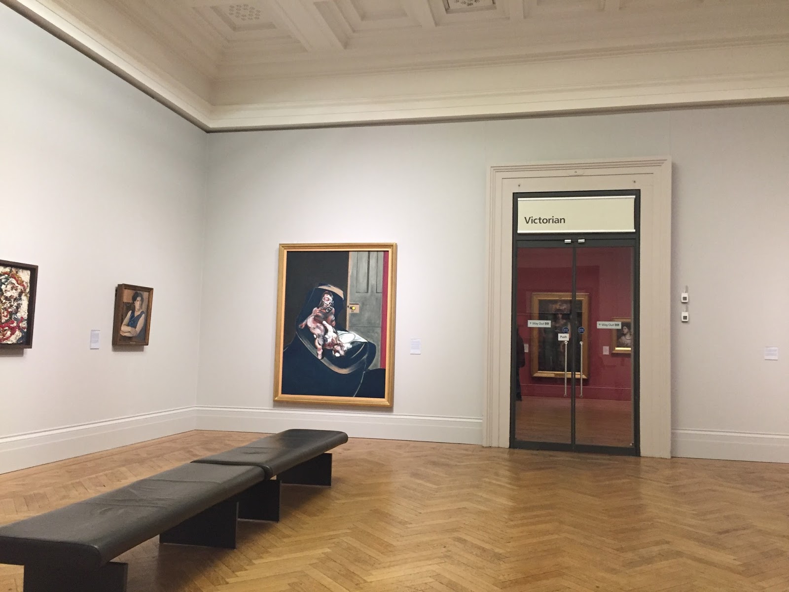
I recently visited Manchester art gallery, formerly Manchester City Art Gallery, which is a publicly owned art museum on Mosley Street in Manchester city centre. The main gallery premises were built for a learned society in 1823 and today its collection occupies three connected buildings, two of which were designed by Sir Charles Barry. Both Barry's buildings are listed. The building that links them was designed by Hopkins Architects following an architectural design competition managed by RIBA Competitions. It opened in 2002 following a major renovation and expansion project undertaken by the art gallery.

Manchester Art Gallery is free to enter and open seven days a week. It houses many works of local and international significance and has a collection of more than 25,000 objects. More than half a million people visited the museum in the period of a year, according to figures released in April 2014.

While visiting this gallery I was thinking about my key word essay and looking out for pieces of work that could relate to my essay that interested me to potentially use for my essay as examples. I also found a few sculptures that were inspiring for my main project (the channel ident) that related to biological and mutational forms that inspired some founding ideas for my sci Fi channel ident and I ended up adapting my idea from these sculptures (I have written about these pieces in my channel ident blog post). 

what it looks like inside:
the front entrance hall had a rather regal visual feel to it with regards to the sculptures in the walls and the wall paper swell as the layout of the room with the steps leading off into different directions etc. 


however there were some rooms that had more modern appearances moving away from this older more regal style and representing the contents of the gallery on a whole which displays both modern and classic art. 


Sappho 1877 by Mengin Charles August. Oil painting on canvas Sappho was a Greek poet who lived around 600BC. She wrote about love, yearning and reflection, often dedicating her poems to the female pupils who studied with her on the island of Lesbos. Many stories are told about her. Mengin has chosen to paint one that says she threw herself into the sea because of unrequited love for a young man: (Still holding in that fearful leap By her loved lyre) into the deep, And dying, quenched the fatal fire At once, of both her heart and lyre.


The room this painting was situated in was an old looking style of rich red walls and wooden floor and furnishings and golden frames an all the paintings. This gave a warmer and more timely feel to the paintings environment and represented the painting itself in this manner showing its years of history reflected in the style of the room. The room was also quiet and echoey which created more of a personal connection to the painting as though looking at it was like looking into a portal or means of connection to its time of creation. 
The painting of the girl was very large and took up the. Amorites of wall height in the room almost reaching the ceiling. This represented the woman in a more realistic powerful and looming way as she was about the actual height a young woman would be nowhere due to where the painting was placed was looking down from above the viewer unmissable and very sad looking. Making this emotion being displayed more intense and more sorrowful. 
The woman wears all black in a gloomy landscape next to a miserable and stormy sea alone. She holds a harp that would represent music joy and liveliness but is instead held by her side as a cruel taunt against her misery and emotional exhaustion. The woman's breast are exposed perhaps representing the lust the poem speaks of (that the painting is based on) but this lust is overpowered by the black viel and sad expression on the woman's face and could combined represent the dangers and heart ache of love and lust. 

Untitled smoke series:
this was a piece in the gallery that was labeled as an unlisted artist and so i was unable to find out who made it however i liked the description and theme for these pieces which was based on the phrase 'smoke and mirrors' that describes a dishonest or imaginary act. The phrase originates from the traditional magic trick in which objects are made to disappear and reappear by moving mirrors whilst the audience is distracted by bursts of smoke as this happenes. 

and so although the piece shows smoke it is possibly representing this theme of somthing being a lie or not real/ a mystery, much like that of the origin (the creator). 

Bestie 2014 Joana Vasconcelos (faience ceramic and crocheted lace)

Portuguese artists joana vasconcelos has taken serious sculpture and subverted it by covering it with crotched lace. She has taken a masculine art form and overlaid it with a craft traditionally seen as feminine to give this piece a more feminist visual effect. 
The horses head that vasconcelos has appropriated is by rafael bordalo pinhiero (1846-1905), a renowned ninetieth century Portuguese artist. His factory still exists and produces ceramics. The lace is made by craftspeople in the Azores to traditional designs. 


This piece could be representing how women can do what ever men can do from a feminist point of view. 


Hylas and the nymphs 1896 John william waterhouse 
Oil on canvas

This pieces is based on the myth of Jason and the argonauts. Hylas who was one of the argonauts who sailed with Jason in search of the golden fleece. When the adventurers harboured on an island Hylas' task was to search for fresh water for the crew. He found a faded spring and was filling his pitcher when he was encircled by nymphs. Hypnotically they drew him into the water and although his friends searched for him he was never found again. 


This piece could be a representation of temptation and giving into temptations.