Self Promotion

I have been looking at art and Graft's shorts to promote themselves where they show a small animation that displays their style, however climaxes to a self promotion logo.
I was considering doing something like this myself as a short self promotional style clip in which i would consider my brand name for myself and design a logo perhaps and then create a short  animation to promote this image.
Here are a couple of clips that Art And Graft has produced that inspired this idea:

Art&Graft Intro - Woodsman from Art&Graft on Vimeo.
Art&Graft Intro - Landscapes from Art&Graft on Vimeo.

Along with a brand name and logo i think of i could incorporate these into a website to promote myself also.

I decided to try making a logo ident for myself as a short promotion animation for my self and to also show a bit of my skills while doing so. I will possibly use this as an intro to my show reel when i come to making it (which i will use to send to employers when i come to looking for employment):


i drew up some quick designs as a guide line for how i want my logo to look and decided it would be best to see how i go when making them from this point onwards to decide on a final logo for myself:


I ended up with a combination for the logo designs in one using elements i liked the most from each one and chose the R and D logo as the main base as i liked how the shapes together made a connecting and curvy overall shape. I kept the colours simplistic but made the shine high to look good quality, because of this i decided to use cinema 4d.
This was the first render i made and although i thought it looked effective when i was modelling and key framing the animation, i decided that i didn't like how the yellow shape intersects the logo.


I came up with the idea for the animation because i wanted keep it simple as the logo is quite simple and i thought too much animation might over power this. the logo to have some kind of reveal which is why i had the shapes pull out from the background and then i thought the opposing spins the two shapes make worked well together and then they finalise at the end to make a balanced composition.

I re rendered the animation out after fixing this and this was the result:


I then took the logo footage into after effects and added the shadow strip across the centre of the design to add a bit of depth as it defines some of the shadows more (so it doesn't look as washed out) but with it only being small still keeps the logo nicely centred:


this is my first attempt at my showreel using this logo design at the beginning to establish myself.
I tried to keep the edits fast passed to keep the viewer enticed and wanted to see more and to make it look like there is lots of work to show. I used clips from practically all the pieces i have made since my first year on the degree to show the variety of work i have been able to produce with regards to the programmes i can use and the range of methods i have gained experience in. I still need to add sound and will use a song for the sound with potentially some of the original footage sounds underneath (such as the pig squeal in the orchard pig clip) to add a bit of depth. I will used an energetic and upbeat song in this to reflect my approach to this profession and my enjoyment and enthusiasm towards my work. In this video i also made sure i added my contact details along with my name and my position of study to provide viewers with some more information.


Vimeo:
My Vimeo:
https://vimeo.com/user37010813

I have made myself a Vimeo account to use for my self promotion as this is a very effective and easy way to send my work off to other designers to look at or potential employers as it is a quick link i can give them to my videos lists or to a specific video (such as most likely, my show reel) and by doing this also offers the option for them to look at the rest of the work i have published on my vimeo. Its low file size to send a link and is quick to access and therefore would be less likely to off put people from looking at it.
To keep this professional and as a means of self promotion i have only included my finished projects on this site unlike my youtube account which i have put all sorts of making of clips/ first drafts of animation etc for me to use to upload onto my blog to talk about my exploration and progress within the projects and my work.

End of Year Exhibition:

Venue - Leaf Gallery :

Although this is being arranged by the college and students across multiple courses, this is going to be a good form of self promotion for my work and myself within the industry and to get myself some recognition potentially from employers.
To prepare for this opportunity to boast myself and promote my self as a designer i am going to have to consider what work i am going to show and how i am going to show it. I had in mind that what could work well for this depending on the space is potentially to have one of my pieces projected onto a wall to grasp peoples attention with some still prints around it and then have my show reel on a small screen near by and some business cards. Obviously i am going to have to visit the space that the work will be being displayed in and consider the size and lighting of the room that i will have to work with and will also have to consider that some compromise may have to be made as i will be sharing the space with other students as well.
Opting on displaying only one of my project pieces along side with my show reel (instead of multiple projects) allows me to celebrate this one piece more as i will have more space for it as opposed to if i displayed more than one project and will more likely catch peoples attention if i do this, and then i have the show reel which shows small elements from each of my projects through out the year which could hopefully create interest and make the viewers want to see more which is where the business cards with my contact details will hopefully come into play.

I am most likely at this point (unless my next project is better somehow), of using my utopia in decline project to display at my exhibition as it is the largest project i have had and i think probably the best piece of work i have produced on this course skill wise and would therefore be the best piece to show to sell myself. And also has the strongest theme that i based the project on. The title of this project i think creates intrigue and the style i have used is bold and so all these factors are good qualities for sticking in peoples minds and making my self recognisable and rememberable. This poster i have made for the project utopia in decline could be used as a good intro before the start of my animation and i could maybe animate this as well to swipe the text and boxes off either side of the screen and have the particles move away and swipe into the start of my animation as these particles are actually a still shot from my forest scene in my animation where the particles do move and so it is also relevant to the content of the animation.


I am going to visit the space at leaf gallery that i will be having to work with sometime in the near future to start getting an idea of how exactly i will be able to lay out my work in order to make appropriate preparations for this and keep on track with regards to what i need to produce in time for this. I have some time to prepare for this after my project deadline's as well and therefore will make any further adjustments on my project pieces that may need to be made even after the marking process of my work is done as the exhibition standards of my work could get me employed.


Business Card:
Another form of self promotion i have to consider is my business card, which i will be making available at my end of year show where i will be exhibiting work as the design on the card is something i need to consider as well because if people do end up taking my cards with them the design on the card could be the selling point that makes them remember my work or sell myself to remind people to potentially contact me.
i need to consider creating design that is relative to my style and recognisable to what the viewers will see of my work so that the connection will be made and this can be used as a signifier of myself and what my work was.

this is one of my first designs for the front of my business card:

I have so far chosen to start with using the particle shapes again that resemble those of the particles in the utopia in decline poster so that it relates to that piece of work and would be recognisable as my business card as an individual. I also like how the particles suggest movement as my profession is within the world of motion as a motion designer and animator.
I also like how the style is bold and shouts at the viewer to hopefully again make it stand out and be recognised by viewers.

I do think however that the style is a little bit too bold maybe and perhaps a bit too cluttered.
Another point i should take into consideration is that a lot of designers i have met have mentioned to me that it is good to see a female designer starting to join the industry (when talking about myself) and that there is a lot to be said in having a touch of femininity brought into the design process and approach to working. The style for this card is very masculine based with the straight edges shapes and strong colours and it could be worth toning it down slightly and trying to make this look slightly more feminine to reflect myself more truly and play up to this slightly although again without moving my self too far away from my own particular style (which i think probably does have a slightly more masculine feel overall) however i do also think that this is a good point to consider as it has been mentioned to me by multiple animators within the industry.

I also think that i should consider what it is that i call myself as thus far i have given myself the title of motion designer perhaps due to the fact that this is the course title that i am studying, however this is not necessarily what i need to declare myself as and i should consider how people would best recognise what work i am capable of creating and what it is that i do with regards to how i define myself.
Potential titles:
Motion Designer
Animator
Motion Graphic Designer
3d Designer
2D designer
3D/2D motion graphics
Motion Designer/Animator i think this is probably the best well rounded form of recognition for my self as it signifies to the majority of people what i do by saying i do animation as this is probably the most recognised title however by also saying motion designer it bring in the idea of the creative element and process towards my work whilst still signifying that i create motion pieces it still suggest i have an understanding of the foundations of the design process such how people would assume graphic designers would and this is an important aspect of what i do. (considering how thing looks nd work together and the rise en scene of my work/ also how i am portraying themes and feelings/moods in the piece and how i am communicating these across).

I have had a look at what some of the designers within the industry are calling themselves and how this reflects their nature of work in order to best consider how to define myself and my work:


Natalie work has a lot of character animation involved in it which i think is what most people do actually think of as well when the term animator is used.


Jack wood cocks style of work is reflected by his title i think as the work he showed me does involve a lot of graphic image pieces moving across screen and text motion as well.


Steve swan boroughs work does have an in-between quality to natalie and jacks work and therefore i would think that this is why he has defined himself as an animator and motion designer.


Business cards:


Show Reel - Rachel Fielding from rachel on Vimeo.

In my show reel now that i have finished my major project and my live brief project i am going to add more scenes to my show reel relevant to my current work for my end of year show as i have been told by designers that it is good to keep your show reel up to date as it makes you seem more active and proactive with the world.


Website:
I have set up a website using square space that i am going to use to promote myself on i will include ethos web address on my business cards for people to find my work on.

Infinity Glasses Project


Infinity Eyewear
This is a side project i am working on where a client approached our college and asked if there were any students available to create some work for him. He wanted a 3D model of a pair of new glasses he is thinking of making and trying to sell. He will need the 3D model so that he can show his potential buyer what it will essentially look like with out having to spend too much money on actually making the finished product. 
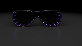
The idea for the glasses is that they will have lights and mirrors inside the lenses and that this will give and infinite lights effect but will still be visible through the lenses so the person wearing the glasses will be able to see the world with a ring of infinite lights around there vision.
He came into visit and i asked what it was that he was specifically after:

Purpose: Novelty for clubbing and nightlife scene. But with a high end style, smart and looks good.
Srtyle: Potentially aviator style glasses, rim as thin as possible (baring in mind lights have to go inside).
Blueish tinted lights, rame colour preferably black and frame as thin as possible.
black environment background preferably, if not then grey
He would like an interactive VR so that the client can spin and turn the glasses model round and see a full 3D view of the product
He would like stills and style frames sent off to see how things are going

Styles of Glasses (image refferences) :

Researching potential frames. This pair has a gap in the frame above the nose (potentially where a battery could go)

                                                                                                                                                                            Style sample idea for the 'clubbing' novelty wear the client was talking about being the purpose for the glasses. 
Environment and display research ideas:
The client discussed how he wanted the glasses, although being made for novelty purposes as they will be for a just bait of fun, to look high end and good quality. One way this can be reflected as well is through the environment that the glasses are situated in when being displayed. I googled some ideas from how apple have displayed their phones in advertisements and they generally seem to use minimalist backgrounds which have no other elements to distract from the product and are often either a black or white background with some use of shadow. 


Infinity style lights:

This is what the client wants the inside of the glasses lenses to look like. The wearer of the glasses will be able to see these lights around the edge of their vision but will also be able to see through the centre so its gives a triply fun effect for the person wearing the glasses. 


Existing product that is similar to what the client is looking for:
(the style of this product is goggles though)

https://learn.adafruit.com/bluetooth-neopixel-goggles/overview


i used this image of glasses i found online that resembles the shape of aviator glasses as this is what the client mentioned they wanted as a style reference and this particular style i found is a bit chunkier take on the style of the aviator and so would be more likely the possible outcome with regards to considering the need for space on the glasses for a battery and for the lights etc.
i then altered the colours on photoshop so the distinction between the shape of the glasses and the background are more noticeable and easier for me to use as a template in cinema 4d to make the glasses model from.

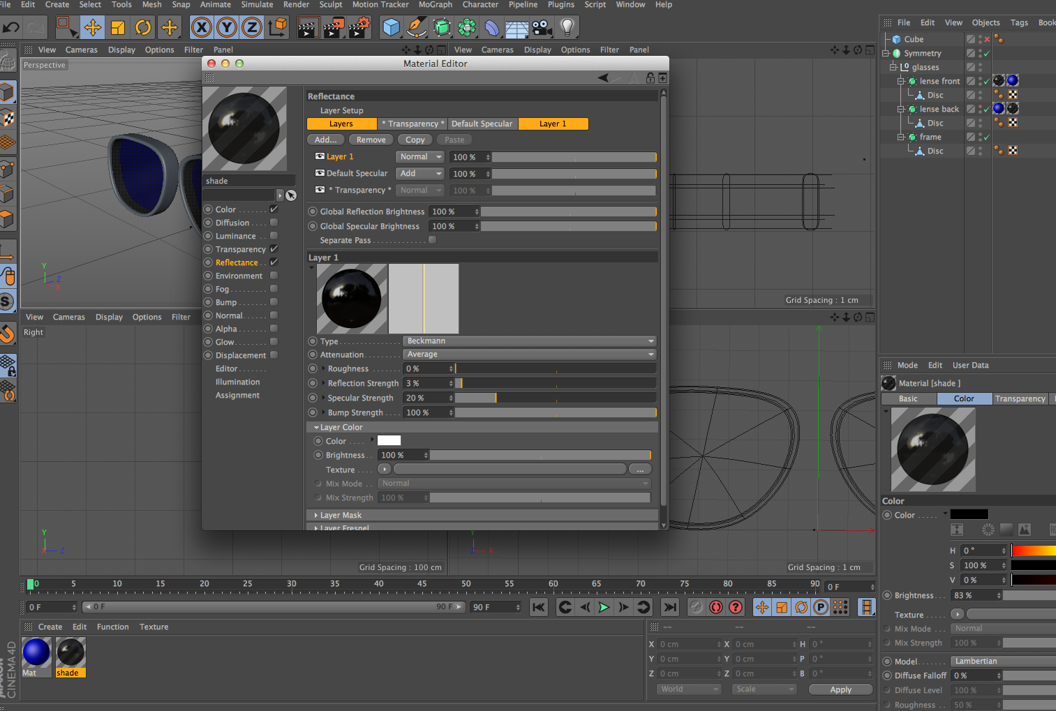
This is when i opened them up in c4d as an image to use.


I then started to make the apes of the glasses  using the reference picture as a shape indicator`:


These are a few of the versions of glasses styles i made for the client to choose from :


Aviator style (slightly chunkier than original aviator style still with regards to the arms and the frame of the lenses) this version i made with a low nose bridge ark:
The arms are thick with this style of glasses as i have placed the battery inside the arm.


These are some images of the glasses of a similar style to above but with a higher bridge ark (i also added nose pads onto this one so that the lenses wouldn't be so low on the face when worn due to a very high nose ark


And i also made a version that would have the battery in the middle section between the lenses i shaded this a slightly different colour to highlight its prences but this could be changed to any colour or made as just one full block. I made the arms smaller on this one to show that this can be done if the battery is not in the arm:
After showing the client these styles they mentioned that they liked the aviator style glasses and the goggles style glasses


Changing the colour of the nose pads:


(video moves very quick because it is a VR converted into a video. however this shows how i have tested the angles and the height of the camera and the number of steps of each angles (the more steps there are the less twitchy it looks when you move it).


This has been a good side project to work on as it has given me experience of actually working for a client, with regards to sending them models and style sod the glasses and receiving feedback and making alterations with regards to how they want the model to look until we arrive at a final conclusion that the client is happy with. It has also given me chance to work on my cinema 4d skills and experiment with using VR animations (which i could not upload onto my blogger account but i will include in my hand in).
This has also helped improve my time management as i have deadlines for handing in the work for the client and i have had to manage my final project management and this side project together (as it meant taking on extra work to deal with this project for the client).

Steven Swanborough Visit And Work Crit


Steven Swanborough a freelance motion designer came in to my college to talk about his work and his experience with getting into the industry to my class as he is a student from stockport college on the motion design studio in 2011. 
He showed us the presentation he held at the last Glug event held in manchester which is an event held ever so often for the local design and creative community. He explained how he defines himself as more of a generalist than a specialist as he works with all ranges of design platforms and techniques instead of just specialising in one area (this is probably something that also helps with his freelance work and flexibility). 
He spoke about how his show reel from university has changed so much looking where he has come to now and said that we just need to keep working even if we don't feel fully self reliant at this point with regards to skills. 
We also spoke about about looking and asking for work experience and for jobs and he mentioned that manchester is a very friendly design community and that we shouldn't be put off searching for opportunities within the industry and spoke about how he went round places with his cv that he had screen printed to make it stand out. This is something i could consider with my cv or to consider presenting my work or getting my work shown in a way that stands out.  
Another thing he told us about that inspired me was when he explained how he got a job at the neighbourhood (a studio in manchester he worked with since he graduated university before he became  freelancer). He explained that the day after his deadline day he went round to 15 studios handing out his cv and showreel and as he was doing so invited people to his final year show, which kind of would give him a second opportunity to grab their attention as well and have a chance to speak to them in more informal relaxed environment whilst still showing the work. This is something i am going to do when my final exhibition is drawing near as i thought it was a very clever way to gather more of an audience for the show. The neighbourhood ended up hiring him for paid internship and then hired him full time from there, so he was able to get a job practically straight from graduating university which is something i would like to try and achieve (or some kind of placement set in place). 

I should also after having this talk consider more about my attendance to animation festivals within the area and getting more involved within the community as steve mentioned that the majority of contacts and clients he now works with have been who he has met whilst at these events. He also mentioned that this is where animators come and discuss and share there work with each other so it is good for inspiration and to get to know the other people within the industry and becoming known. Motion north and Glug are two animation events that he mentioned were good to attend. 


I thought having Steve in for this talk was extremely helpful as it was good to speak practically one to one with somebody who was in the local industry as he has been stockport and manchester based and therefore his experience of traveling through the industry was closer to home and even started to help with getting to know and hear about the people in the existing community more. 

He also showed us some of the work he has done and one thing that stood kurt when he was discussing his work was when he mentioned that he decided to make a brand for himself to promote his work as this is something i have been considering doing. Perhaps setting up my own website to display my work and have a professional way of showing potential employers my work. I could link them to my website and have my show reel on the home page so that it can be the first thing they see to display my work to them easily but then after they have watched it they could travel around my website and encourage them to spend longer looking at work i have done/ showing my strengths to them. 

I then went onto find his website to have a look at how he has organised and designed the space to get some inspiration for when i come to do my own. 

When you click on the website link this is the first page that comes up. It gives you adoption link to go to his site and and option to click on the showreel, with a showreel of still of work he has made as the background images. He has also used his brand logo that he has m,are on this page and kept it simplistic. I like how this is simple and easy to navigate with out the user feeling like being on the website is going to eat into their time, yet still manages to persuade the viewer to have a longer look (with the option for the website link). 


On the website link there is then the portfolio page in which you can click on each individual project he has worked on and see a description of who it was made for and why and then the development of the work and some research etc (so showing work surrounding the pieces as well). this is good as it shows the amount of work that has gone into each project and gives chance to highlight more of what has gone into the projects. 


There is also an 'About' link on the website that gives information about him as a designer and what kind of work he does. I thought this was a clever way of showing this (by giving snappy titles to each section of work keeping it all quick and simple and stylised to read).


I also liked how on the clients link on the site he had put the logo brands of the clients he had used again making the page more enjoyable to view while still getting the information across (with as little reading as possible). 


Before Steve Swanborough spoke about himself and his work he had chance to look at some of the work i have done and the project i am working on so far and was able to give me some feedback on it.
He suggested that i shorten my silhouette forest piece or add more narrative which is similar feedback to what i have received previously from other designers and shows that this is defiantly something i should alter with this piece. He also suggested making the movements of my character animation smoother and less jolting which would make the flow of the piece look smoother, he also told me that my idea for the project i am currently working on is good and that considering i am using c4d to create the animation i should try and go for a more stylised approach as this would add interest and creative feel as well as uniqueness while also not highlighting my weaknesses with regards to the level of skill i have when using the programme.